E-Commerce app
One-click coffee ordering system
The Israeli coffee leader, first approached with a clear and concise request: to create a 1-click coffee ordering system for their clients. In addition, the app should provide users with all the information about the coffee products and the ordering process, in an intuitive and easy-to-use manner.
This project was made in collaboration with Globalbit – the leading Israeli tech and entrepreneurship portal.
Product and Business Goals
Based on the client requirements and pain points of the mobile shopping, I had to find a perfect solution to meet the following objectives:
👨🚀 Serve different types of users
🚅 Create a faster and easier ordering process
⚜️ Personalize the order process
💰 Increase profit margin
My Role
I coordinated and led all phases of design including:
- User Research
- User Flows
- Prototyping
- Visual Design
Team
- 1 Product Designer
- 2 Visual Designers
- 3 Mobile Engineers
- 1 Backend Engineer
- 2 QA Experts
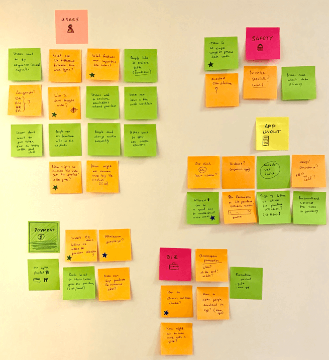
Exploration Strategy and Research Methods
Effective product design starts with understanding the problem space through research.
My research approach included:
• Competitive Analysis: Studying how similar problems are solved in other environments.
• Process Analysis: Observing and mapping the current ordering workflow.
• Questions & Assumptions: Defining key research questions and validating hypotheses.
• User Needs Identification: Extracting core insights from customers behaviors and expectations.

1. Competitive Analysis
Building a one-click coffee ordering system around such a service presents a challenge, as it is not a widely adopted practice. To ensure a solid foundation for user experience design, I began with a competitive analysis of major players in the market. Conducting thorough industry research was crucial to understanding existing solutions and identifying opportunities for improvement.
I gathered detailed insights on competitors, including their company background, product offerings, mission, and business model. I also analyzed the first impression of their app, the user journey, and key pros and cons. This competitive analysis helped pinpoint market strengths and weaknesses, potential gaps in existing solutions, and unique opportunities for our product. Ultimately, it served as a strategic foundation for creating a system with a clear competitive advantage.
2. Process Analysis

To gain a deeper understanding of the product specifications and industry standards, I conducted an audit of the company’s offline coffee ordering process. This allowed me to identify existing workflows, inefficiencies, and potential areas for improvement.
To gather well-rounded insights, I interviewed key departments, including R&D, Customer Success, and Marketing. These discussions provided valuable perspectives on operational challenges, customer expectations, and business objectives, helping shape a more effective and user-friendly solution.
3. Questions & Assumptions
Asking the right questions is essential when building user-centered products. I design experiences based on user insights and data, rather than relying on assumptions. By systematically identifying key questions and validating assumptions, I minimize the risk of misalignment with user needs and ensure a more accurate, user-friendly solution.
The Questions & Assumptions method helps me uncover blind spots, challenge biases, and refine the design process. By addressing uncertainties early, I can make informed decisions that enhance usability, efficiency, and overall product success.
4. User Needs Identification

To create great user experiences, it is essential to focus on user needs rather than assumptions. The competitive analysis and in-depth study of the company’s processes provided a strong foundation for the next phase: identifying user needs and pain points.
I categorized customers into distinct user segments to tailor the experience effectively. By the end of this process, I identified seven clear customer groups, including Registered Clients, New Customers, Competitor’s Clients, and Occasional Users.
Combining these insights with usability methods, I designed an adaptive mobile service that not only caters to each user group but also anticipates their needs.
My UX research focused on the entire user journey, from pre-purchase decision-making to post-shopping engagement. Based on the different user types, I mapped out user journeys to shape an intuitive and seamless experience.
The key was to create a smart and personalized flow that guides users through their first goal—whether ordering coffee capsules, purchasing a coffee machine, or redeeming a bonus—while encouraging ongoing engagement with the company’s products.
The result was a wizard-driven experience that simplifies onboarding and enhances long-term user retention.
Seven Unique User Types
Through in-depth research, I identified seven distinct user types, each with unique behaviors, needs, and challenges. This insight allowed me to design a tailored experience that ensures a seamless and intuitive journey for every user.
This visual represents seven different user types based on their account status, phone identification, and machine ownership, each assigned a specific login process (A–G) to ensure a personalized onboarding experience.

User Flow Overview
This user flow chart outlines the journey users take when interacting with the coffee ordering system. It begins with user identification, determining whether they are a new customer, returning customer, or lead. Depending on their status, users may go through phone number verification, machine selection, or eligibility for gifts. Some may need to scan a machine or access a help screen before continuing.
Once inside the main interface, users can browse the store, customize a pack, or follow a guided wizard flow. The process then leads to checkout, payment, and delivery confirmation. This structured flow ensures a smooth, personalized experience, improving engagement and conversion rates.

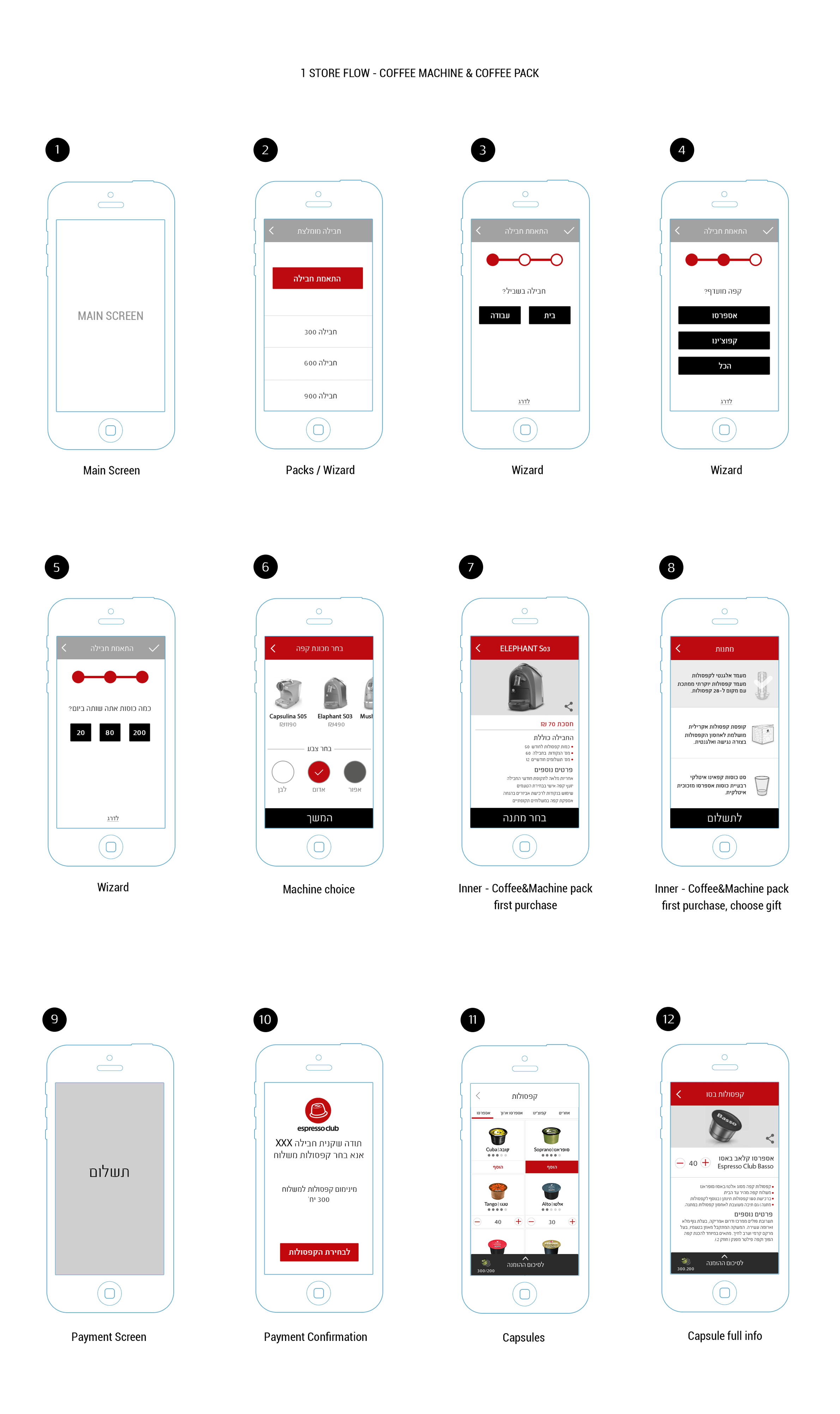
Wireframes
The journey starts from the main screen and progresses through a guided wizard, where users select a pack, customize their preferences, and choose a coffee machine. The flow ensures a step-by-step selection process, making it easier for users to navigate and make informed decisions.
The wireframes also showcase the payment process, followed by access to the capsules store. The structured design enhances usability by simplifying product selection, guiding users seamlessly from product discovery to checkout.
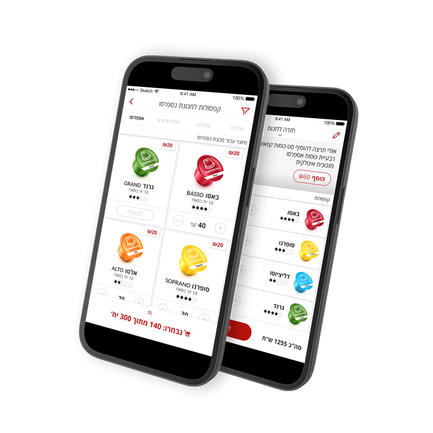
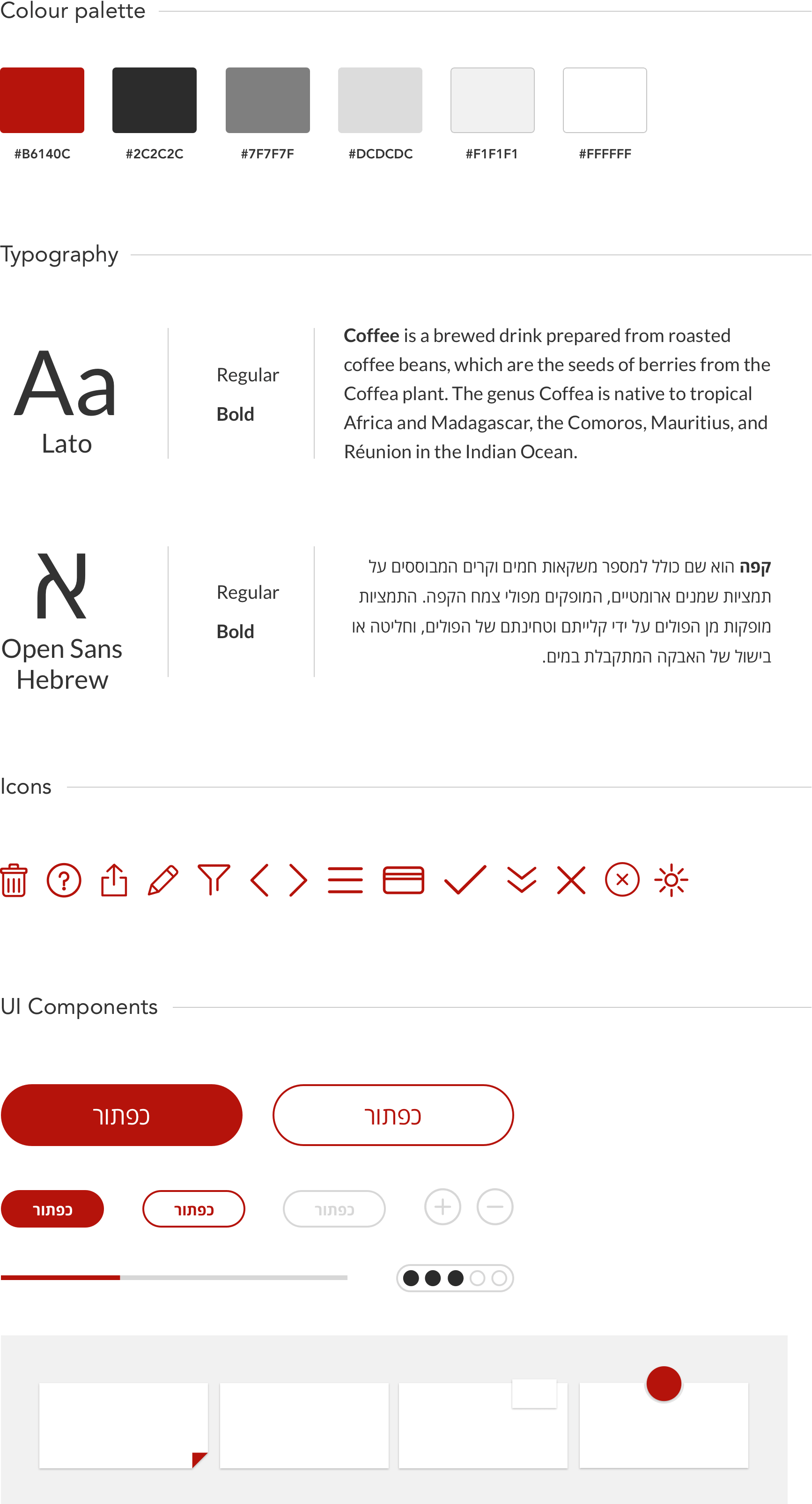
Pixel Perfect
The goal of the visual design was to maintain a minimalist aesthetic that seamlessly aligns with Espresso Club’s brand identity. Every design choice was made to ensure clarity, simplicity, and ease of use while reinforcing a premium and modern look that resonates with the brand’s audience.
Below is an overview of the design process and key steps taken to fulfill the primary objective: creating a seamless 1-click coffee ordering system. The approach focused on efficiency, intuitive navigation, and a frictionless user experience, ensuring that customers can place orders quickly and effortlessly.
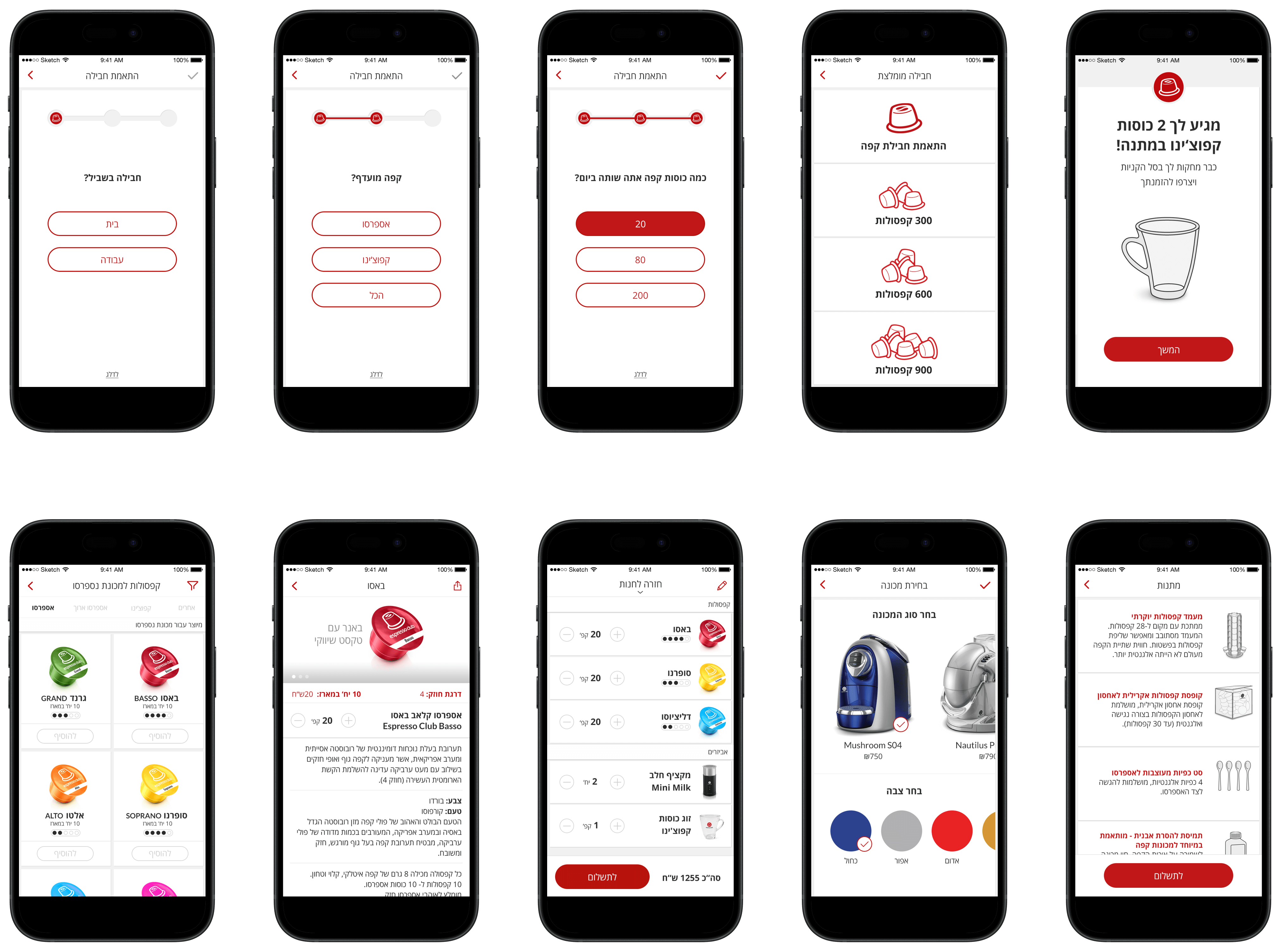
Selected Components
Outcome
This research and insights helped to create an outstanding mobile and web service, customized for each group of clients with the ability to predict their needs.
Building this product has led to the business market expansion and, consequently, to the growth and strengthening of the company’s capabilities.
The app perfectly serving clients and helps the company:
• Acquire new users.
• Minimize customer acquisition
• Minimize customer service costs
• Increase market share
• Decrease customer churn
• Maximize profits per customer
• Improve the overall quality of service