EdTech MVP makeover in just 26 hours
Who
A forward-thinking EdTech startup developing a web-based learning platform infused with gamification, designed to engage both adult and child learners. With a small founding team and no in-house product or design specialists, they brought an MVP to market that offered significant potential for interactive education but faced challenges delivering a cohesive experience for its diverse user base.
Vision
Their vision was to create a digital space where learning would feel playful and motivating, combining age-appropriate game mechanics with intuitive experience.
The Challenge
🧶 Goal
Create maximum value with minimum effort and no burning time or budget on complete rebuilds.
🎯 Realities
1️⃣ Website and platform felt disconnected: inconsistent look, unclear content, bumpy user journeys.
2️⃣ Frustrating bugs, onboarding that didn’t “welcome” users, and a learning process that risked to lose users due to weak UX.
3️⃣ No clear visual direction, and a team stretched thin – what to improve first?
My approach
Respecting privacy and sensitive information is a cornerstone of my work with startups. This case study intentionally omits specific names and visuals to honor that commitment. It emphasizes how I prioritize delivering measurable results through smart, adaptable design and collaboration regardless of restrictions.
My approach ensures that client confidentiality is never a barrier to showcasing real value and actionable outcomes, making me a reliable partner for startups navigating competitive, fast-moving markets.
The design sprint: 26 hours >> Maximum value
Step 1: Discover
- Full UX/UI Audit: Reviewed 20 screens, 3 core flows (from first visit to feature use).
- User Insights: Dug into audience motivations, frustrations, and what excited them about learning, the startup provided the research summary.
Step 2: Define & Prioritize
- Pinpointed two critical flows (onboarding and learning) – where improvement would have the biggest impact.
- Identified key usability gaps: consistency, bugs, navigation hurdles, unclear objectives on main pages.
Step 3: Ideate & Align
- Brought real-world inspiration: reviewed competitor and non-competitor design references with the team.
- Agreed on a visual direction: flat color, rounded corners, light mode – modern, approachable, and quick to implement.
Step 4: Design & Prototype
- Simplified user journeys, made flows feel lighter, added positive touchpoints (gamification).
- Redesigned 8 screens with the new look and feel, ensuring all elements were built to be reused far beyond these initial updates.
- Created a foundation for a design system, so the dev team could easily expand improvements onto untouched areas.
Step 5: Deliver & Empower
- Kept changes fast and smart: most UI updates applied through CSS for visible results without full code rewrites.
- Coached the dev team in real time, so the new visual and UX patterns would be carried forward confidently.
- Documented guidelines so the startup could keep growing their platform, screen by screen, with consistency and purpose.
What happens when smart design meets a small, determined team?
In just 26 hours, a focused UX sprint turned a fragmented MVP into a cohesive, engaging platform. Through small but strategic design moves, we boosted learning flow completion and onboarding success -> proving that clarity and playfulness can drive measurable impact even without big budgets or rebuilds.
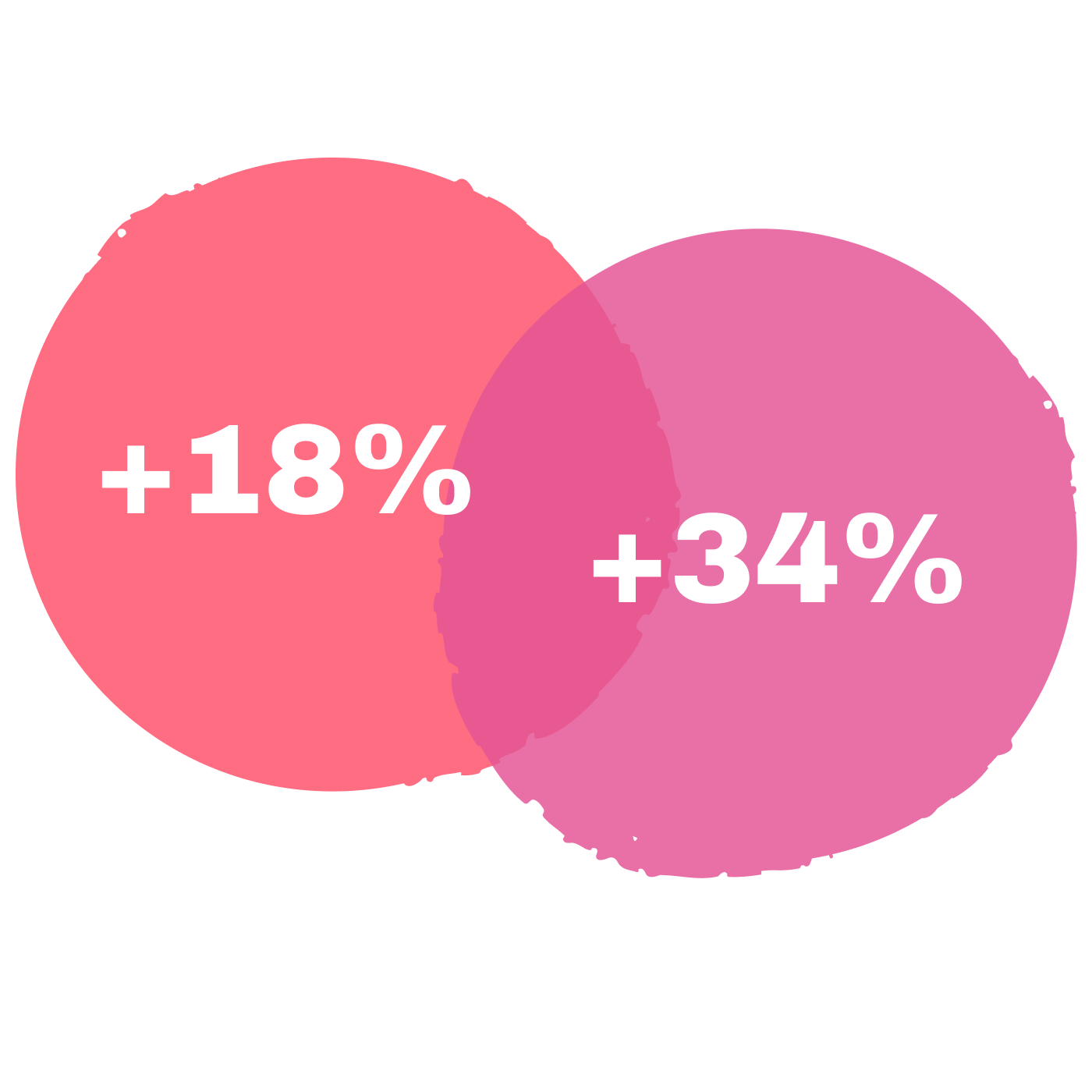
+18%
Increase in user onboarding completion
+34%
Uplift in overall completion of the learning process, confirming the value of targeted improvements
Some statistics of the project
26
Time invested
20
Screens reviewed
3
Flows analyzed
8
Screens redesigned
7
Critical issues solved
Why This Approach Works
No big teams, no huge budgets. Just focus, collaboration, and user-centered design thinking. This process turned a good MVP into a product that’s modern, welcoming, and easy for both users and devs to love and all in under two days.
If you want your MVP to shine without burning months or money >> start here.
Let’s unlock your product’s potential.