
One Agent redefines the real estate experience, serving business professionals and high-achievers seeking seamless, trustworthy service.

Overview

This redesign project aimed to align the brand with its bold, youthful vision while ensuring it resonated with the target audience of business professionals. My responsibilities extended beyond branding materials to include the design of a striking exhibition booth that would capture attention and reinforce the brand’s new identity at the event.

Target Audience

Business travelers and professionals attending the hospitality event, who prioritize efficiency, clarity, and innovation in real estate solutions.

Objectives

One Agent faced a dual challenge: their existing branding lacked emotional resonance and distinctiveness, making it difficult to stand out in a crowded market. The goal was to craft a fresh identity that would:

Elevate brand recognition in a competitive real estate landscape.

🤩 Establish an emotional connection with a target audience of business professionals and travelers.

💎 Differentiate One Agent as the fearless, youthful, and trustworthy choice for modern real estate solutions.

My Responsibilities

As the lead designer, I was responsible for overseeing every aspect of the brand’s transformation.

This included:
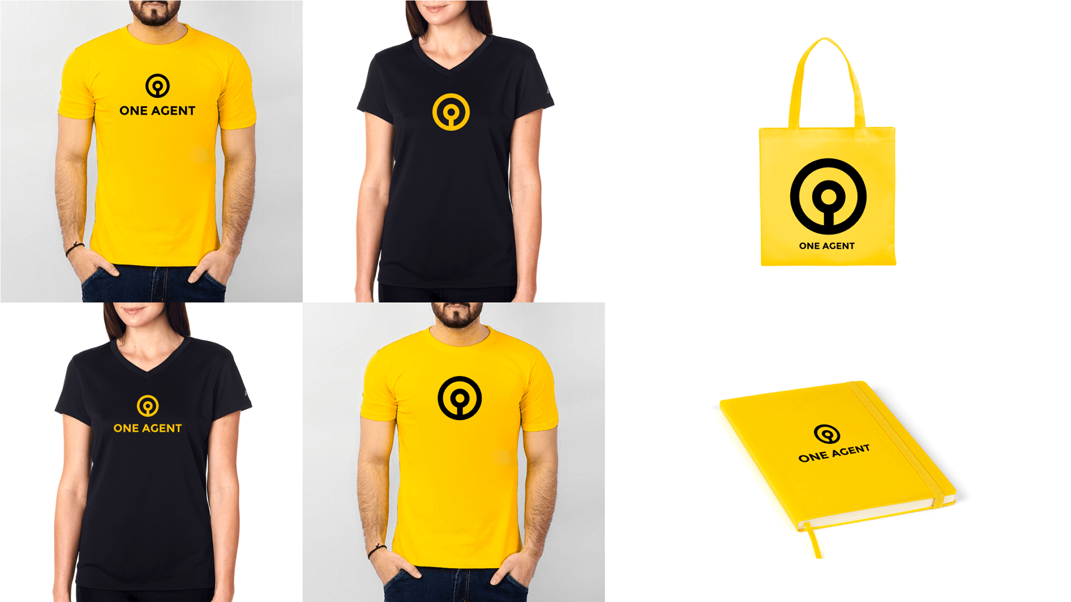
1. Brand Identity Redesign: Reimagining the logo, typography, color palette, and tone of voice to align with One Agent’s bold and fearless vision.

2. Visual Storytelling: Crafting an emotional message using a word cloud, mood boards, and logo shape evolution to create a compelling narrative for the brand.

3. Booth Design: Designing a striking and cohesive exhibition booth to showcase the new identity at a prestigious hospitality event, ensuring maximum impact and engagement.

4. Strategic Direction: Aligning the branding efforts with the client’s goals and the event’s requirements, ensuring the new identity resonated with business professionals in the hospitality space.


Design Process

Discovery & Ideation

Conducting research to understand the client’s mission, target audience, market landscape, and brand aspirations

Conceptualization

Creating a unique and impactful logo that embodies the brand’s values and creativity

Visual Identity

Developing a cohesive look with vibrant colors, modern typography, and complementary design elements

Messaging Development

Establishing a distinct tone to foster emotional connection with the target audience

Mockups

Demonstrating the brand’s adaptability with digital and physical mockups

Brand Guidelines

Providing a comprehensive style guide for consistent and scalable branding

Core Inspiration

The word cloud distilled the brand’s core values and themes into a visual format, providing a foundation for the tone of voice and design direction. It helped align the emotional messaging with the brand’s purpose, ensuring consistency across all elements of the project.

The Story Behind the Symbol

As part of the One Agent rebranding, we developed a custom icon that visually captures the brand’s identity, values, and purpose. Instead of using generic imagery, we created a unique symbol by combining meaningful elements:

  • A human figure representing the agent
  • A key symbolizing access and trust
  • A keyhole, suggesting security and precision
  • The letter “O”, anchoring the brand name visually

Brand Elements

Finalized Logo

Merchandise

Tone of Voice

Overview
Our tone of voice embodies who we are as a brand and how we communicate with our audience. It is not just what we say but how we say it, reflecting our brand’s personality in every interaction.

Objectives

  1. To build a strong, relatable connection with our audience
  2. To maintain consistency across all our communications
  3. To differentiate our brand from competitors by our unique style

Friendly and Welcoming:

We approach our audience as friends, offering warmth and support in our words. We want our users to feel at ease and included, like they’re part of a community.
Example: “Hey there! We’re so glad you stopped by. Let’s get started on this journey together.”

Professional but Approachable:

While we ensure that our communications convey expertise and authority, we avoid overly complex jargon. We aim for clarity and simplicity to make our content accessible to everyone.
Example: “Let’s break it down — here’s what you need to know.”

Inspirational and Aspirational:

We strive to inspire action and encourage our audience to achieve their best. Our language should motivate and uplift.
Example: “Imagine what’s possible when you unleash your potential. Let’s make something amazing happen.”

Convention Booth

Conclusion

One Agent’s new branding is a fearless leap into the future of real estate. It’s young, fresh, and ready to inspire trust in the next generation of homeowners. This is more than branding—it’s a movement.

Challenges & Solutions

Integrating bold creativity with a serious industry required careful balance. Iterative testing ensured the identity felt fresh without alienating traditional clients.

Takeaways

Great branding isn’t just visual—it’s emotional. Crafting a tone of voice that resonates was as crucial as designing the logo.

Thank You!