Planned.me MVP - Testing startup ideas the smart way
This case is about my experience as a co-founder exploring a startup idea. I led the MVP creation, built the product concept, managed research, and handled design. We kept it simple: just a landing page and a domain name to test if people cared, before risking more time or money.
This is why I completely understand you and your goals as founders!
Who
We set out to help event organizers who were tired of jumping between tools to find the right vendors. There was no product yet, just a team and a problem to solve. I was responsible for turning our idea into something we could actually test.
Vision
We put our main promise front and center on a website and asked for feedback right away.
The lean MVP strategy let us learn what resonated, refine messaging, and identify the most promising audience segments. This first digital handshake was designed to capture intent, measure traction, and build the foundation for future growth, ensuring that every next step would be user-driven and market-informed.
My goals
- Build a real foundation through research, not just gut feeling.
-
Analyze competitors to find gaps in the market.
-
Define a proto-persona based on intended audiences and authentic needs.
-
Write a clear problem statement and value proposition.
-
Design the landing page UX/UI to ensure an engaging, intuitive user experience that clearly communicates value and drives conversions.
Phases and Key Content
PHASE 1
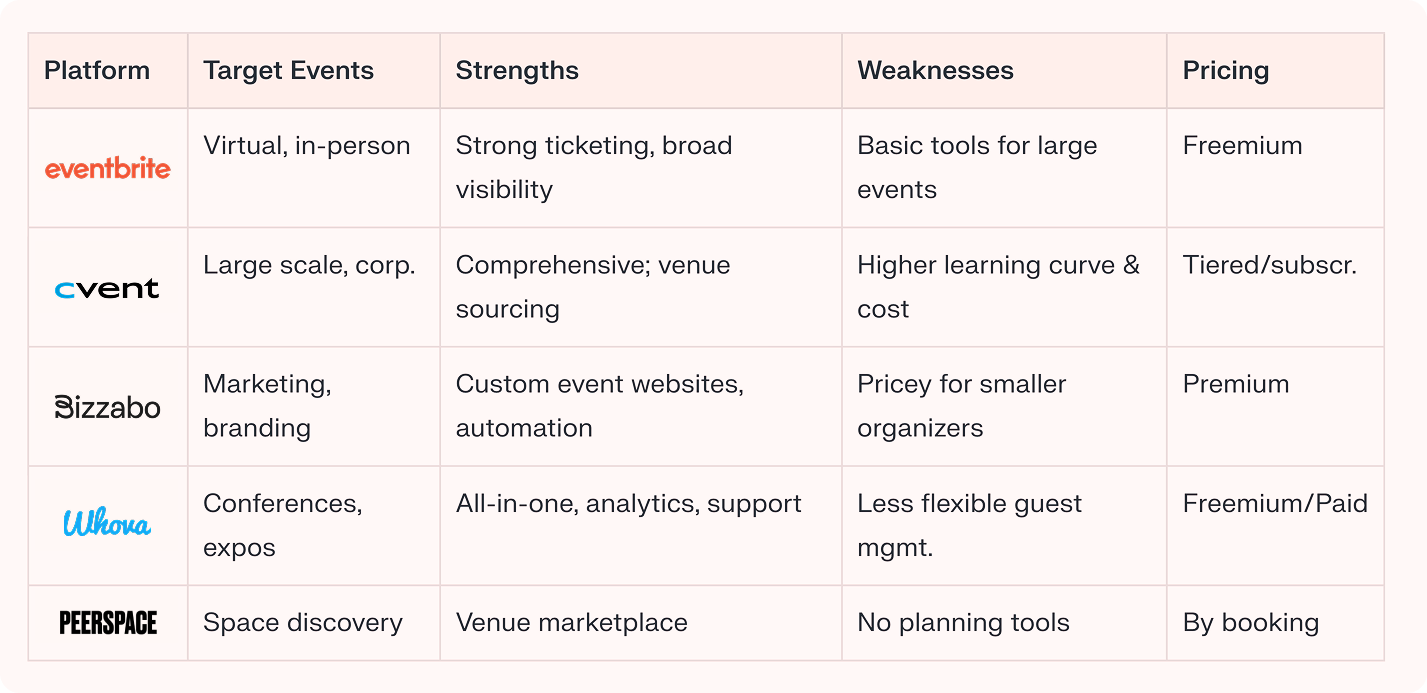
🏪 Competitive Analysis
Surveyed 10+ leading event planning platforms and online marketplaces to benchmark features, positioning, and service gaps.
Insights Table
-
Most platforms focus on ticketing, venue, or management; few prioritize vendor selection or lean-back planning.
-
Manual filtering and communication were critical pain points.
-
Premium platforms offer powerful tools but require setup, onboarding, or high fees – leaving a need for simple, helpful planning marketplaces.
Top 5 Competitors
PHASE 2
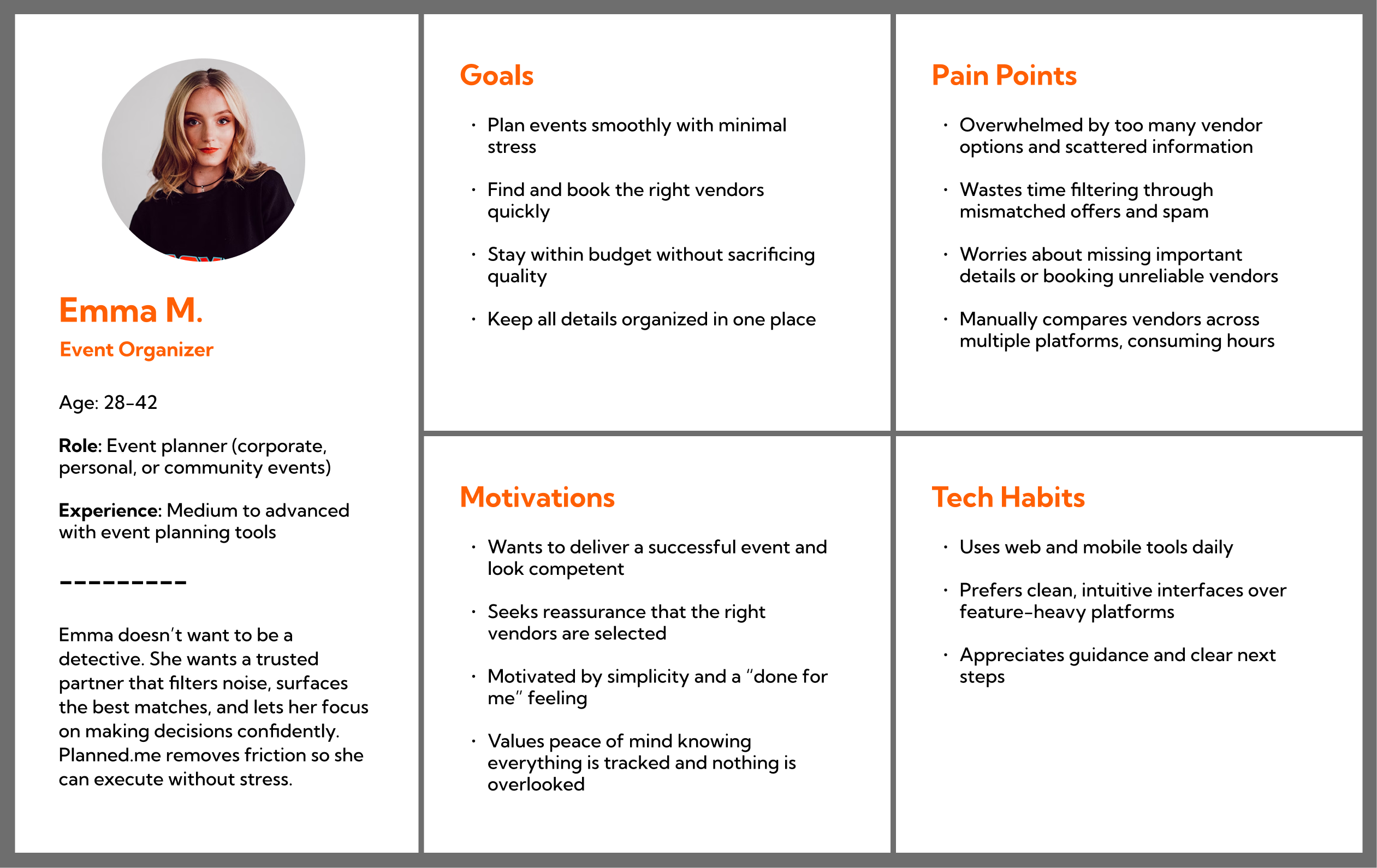
👩🏽💼 Proto-Persona
To ensure Planned.me’s landing page resonated with real users, we built a research-backed proto-persona representing the core target audience. This persona guided all messaging, design, and CTA decisions, ensuring every element addressed genuine needs and motivations.
PHASE 3
🛠️ Problem Statement & Value Proposition
Problem Statement
Event organizers waste time searching multiple platforms for vendors, filtering through irrelevant offers, and managing scattered information. They worry about booking the wrong vendors or missing critical details. This friction causes stress, delays planning, and eats into time that should focus on event strategy.
Value Proposition
Planned.me solves this by centralizing vendor discovery and filtering options based on specific event needs. Organizers get a curated, organized experience where they see only relevant vendors, compare quickly, and book with confidence – all in one place.
Streamlined
One dashboard replaces fragmented search across multiple platforms
Filtered
Vendors match event requirements. No irrelevant noise or spam
Organized
All details, timelines, and bookings stay in one place
Supportive
The platform handles the heavy lifting so organizers focus on decisions
PHASE 4
🌅 Landing Page UX/UI Design
Core Design Principles
The landing page prioritizes clarity, trust, and ease of action. Emma should understand Planned.me’s value within 10 seconds and know exactly what to do next without friction.
The color palette (coral, teal, white) is modern and memorable. The page does what an MVP should do: test whether the concept resonates.
Hero Section
A bold header with “Your wishlist is our command” paired with a clear subheading and illustration. The CTA button sits prominently. The layout is wide and spacious, Emma has room to digest information.
How Planned.me Operates
Four icon-based sections laid out horizontally explain the core value:
- Globally
- Efficiently
- No Spam
- Lean Back
Value Proposition
Three circular sections with individual benefits. They are spaced out vertically down the page, each getting Emma’s full attention before scrolling to the next.
Frequently Asked Questions
Emma’s concerns are answered before she even needs to ask. Seeing clear, honest responses builds her trust and helps her feel safe trying something new. She knows you’ve thought about her experience.
Bottom CTA strip
This is the moment to act. A single field and a bold button make it easy to sign up.
Why This Approach Works
Running a landing page MVP is a fast, low-cost way to validate your concept before founders commit to product development. Instead of building features nobody wants, you test for real interest and feedback upfront.
This saves significant time and money and lets you pivot or stop early based on results.
Outcome
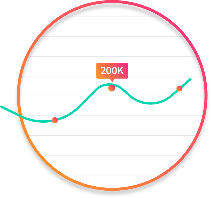
This MVP was actively promoted online for 6 weeks, which is a typical timeframe for startups to gather meaningful data from ads and organic traffic. Despite the promotion, the we did not receive enough genuine interest from visitors (signups and engagement were below the goal.)
By investing in a simple landing page MVP and a domain name (instead of months of design and development), the founding team avoided further spend and effort on a concept that wasn’t validated in the market. This quick test helped everyone decide not to invest more resources into building unproven software.
As one of the potential co-founders, I was directly involved in defining, launching, and testing the MVP, ensuring we followed best practices and only invested in essentials. The lean approach allowed us to learn fast and make a clear decision, illustrating responsible risk management for startups.
Do you also have an idea? Let’s MVP it!