Overview
To create a bold, standout visual identity that captures Product.Rocks’ mission of democratizing e-commerce while connecting deeply with young, fearless creatives.

Product.Rocks an e-commerce platform focused on empowering publishers, creatives, and small businesses, it makes deploying personal stores as simple as a single click.
To create a bold, standout visual identity that captures Product.Rocks’ mission of democratizing e-commerce while connecting deeply with young, fearless creatives.
Creative minds – artists, photographers, schools, bloggers – ready to foster brand communities and expand their influence with ease.
I led the entire branding process from start to finish. With no pre-defined vision or direction from the client, I took full creative ownership, shaping the strategy, design, and implementation. Acting as strategist, designer, and storyteller, I transformed their abstract ideas into a crystal-clear, cohesive identity that exceeded expectations.
🧲 Create a magnetic brand identity that reflects Product.Rocks’ cutting-edge technology.
✨ Connect emotionally with young, dynamic audiences, translating technical brilliance into relatable visuals.
🤩 Develop a visually stunning and bold design that inspires trust and excitement.
💎 Differentiate Product.Rocks in the competitive e-commerce landscape, making it a go-to platform for creatives and publishers.
Discovery & Ideation
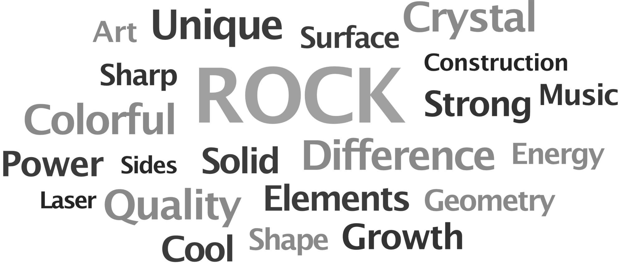
Explored the brand’s essence, creating moodboards and word clouds to capture its personality
Conceptualization
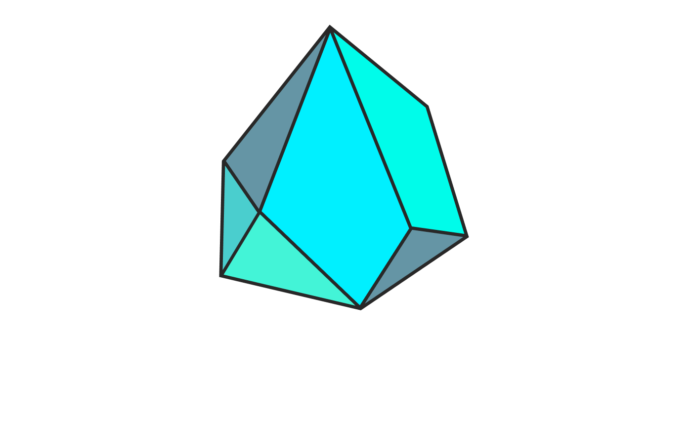
Crafted a sharp, crystal-inspired logo symbolizing precision and creativity
Visual Identity
Developed a vibrant palette, modern typefaces, and crystal-inspired elements to embody the brand energy
Messaging Development
Created storefront and digital mockups to showcase the brand in real-world scenarios
Visual Prototyping
Defined a young, fresh, and fearless tone to connect emotionally with the audience
Brand Guidelines
Compiled a style guide to ensure consistency and scalability across all touchpoints
The word cloud distilled the brand’s core values and themes into a visual format, providing a foundation for the tone of voice and design direction. It helped align the emotional messaging with the brand’s purpose, ensuring consistency across all elements of the project.

After finalizing the logo shape, I explored various iterations to refine its visual impact. This included experimenting with different color palettes, typography, and stylistic details to ensure the logo aligned with the brand’s identity. These variants allowed us to evaluate the design’s versatility and adaptability across different contexts.
Simulating real-world products brings the brand to life, making the designs feel tangible and relatable. By creating branded merchandise, we demonstrated the logo’s versatility and visual impact across various applications, from apparel to stationery. This step not only adds motivation but also showcases the potential of the brand in real-world contexts.
The tone of voice is essential in shaping how the brand communicates and connects with its audience. It ensures consistency across all messaging, reinforcing the brand’s personality and values. By defining a clear and relatable tone, we created a framework for meaningful interactions that resonate emotionally and build trust with the audience.
This project wasn’t just about creating a brand; it was about inspiring a movement. Product.Rocks’ new identity proves that great design can simplify complexity, spark excitement, and elevate a business to its next level.
Translating technical innovation into emotional appeal was no small feat, but focusing on clarity and creativity brought the vision to life.
True branding is about connection. Bringing bold ideas and sharp execution to create an impact.
Thank you for reading