
Spark Hackathon is a recurring initiative focusing on Holocaust education, remembrance, and addressing the daily challenges survivors face.

Overview

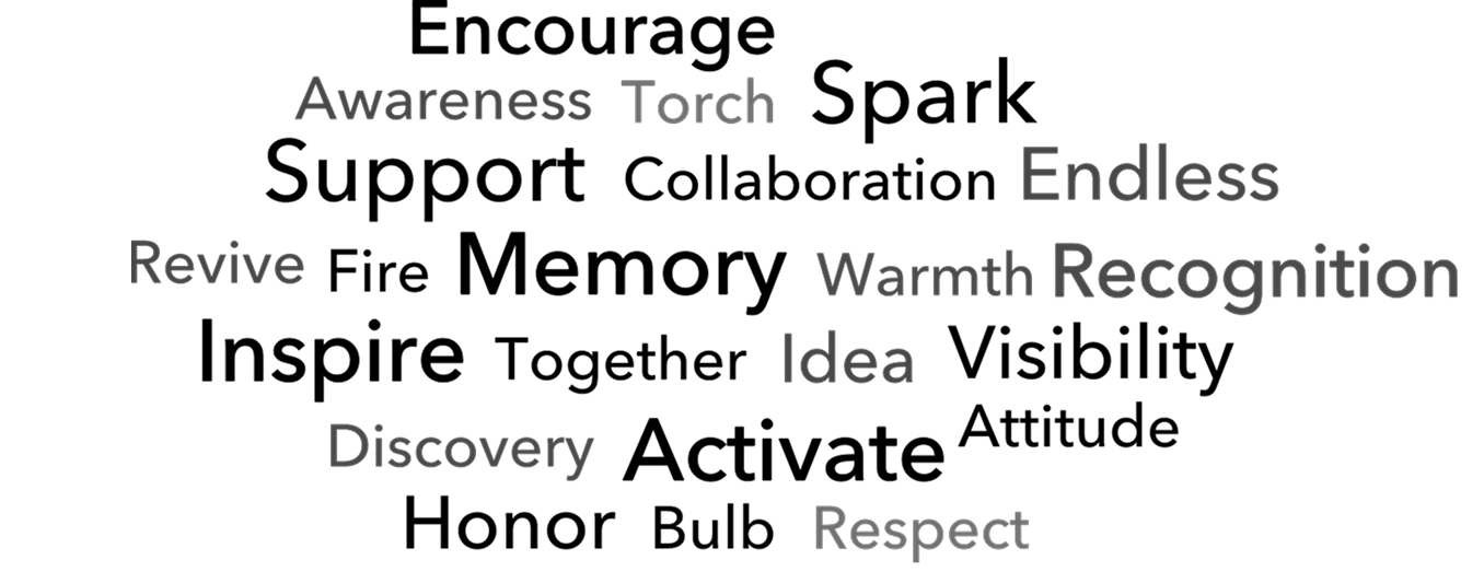
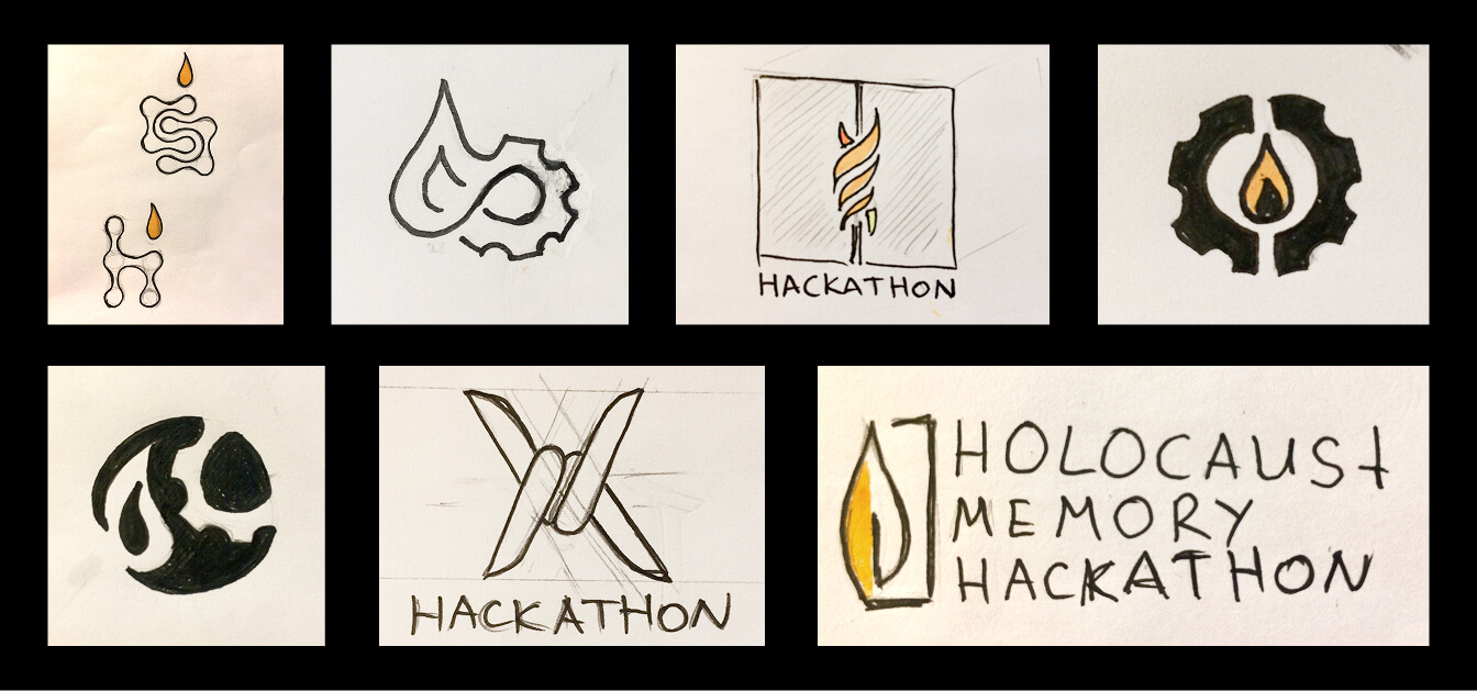
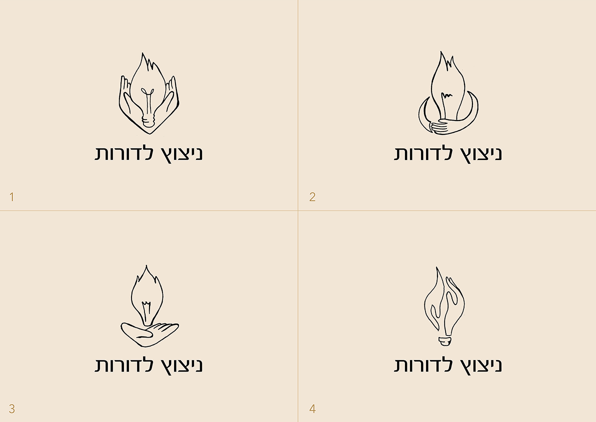
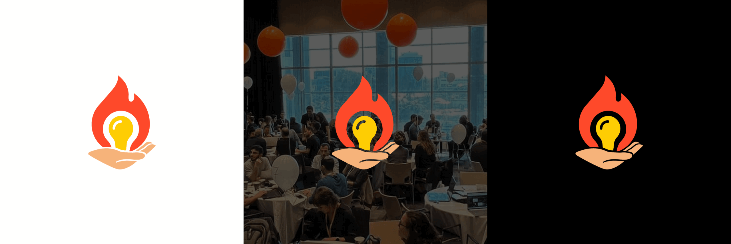
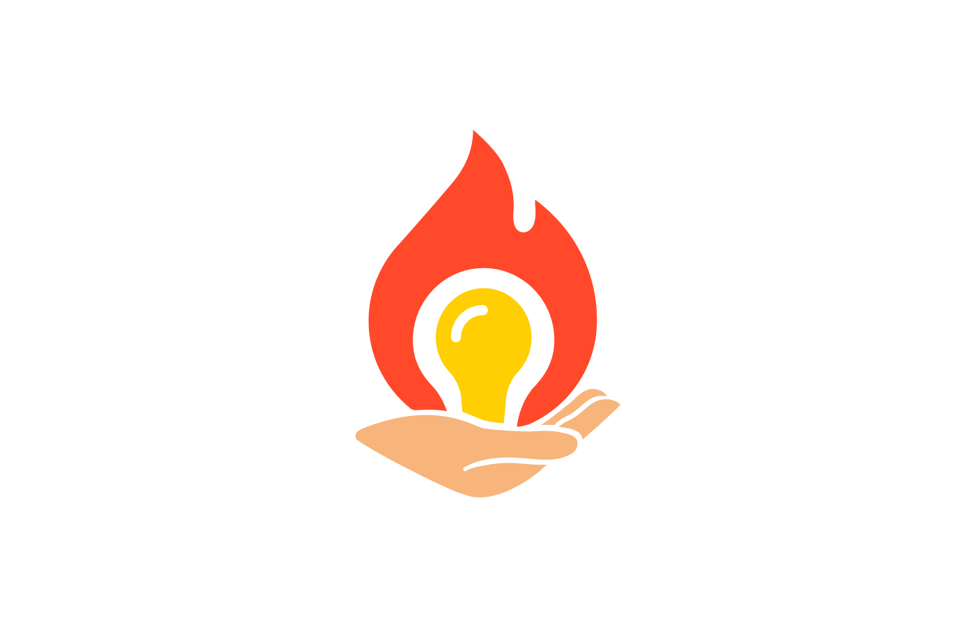
This project aimed to refresh the Spark Hackathon’s identity to better align with its mission of innovation, Holocaust remembrance, and supporting survivors. A key focus was redesigning the outdated logo to create a modern, impactful symbol that resonated with participants, stakeholders, and the event’s meaningful purpose. In addition, my role involved crafting a cohesive visual identity and producing all physical and digital materials to ensure a seamless and professional event experience.

Target Audience

Developers, designers, and innovators passionate about using technology to make a social impact, as well as Holocaust survivors, community leaders, and educators seeking creative solutions and meaningful collaborations.

My Responsibilities

As a co-founder of the Spark Hackathon in Israel, I played a pivotal role in shaping the event’s vision and execution. I led the branding and design efforts, ensuring a cohesive and impactful visual identity for the hackathon. My responsibilities included:

Objectives

✨  Develop a bold and meaningful visual identity that embodies the hackathon’s mission of innovation and social impact.

🤩  Design cohesive physical and digital materials to ensure a seamless and professional experience for participants and stakeholders.

💎  Create a visual narrative that connects emotionally with Holocaust survivors and inspires innovators to engage deeply with the event’s purpose.

🕊️  Elevate the hackathon’s brand recognition and establish it as a platform for socially impactful technology-driven solutions.

Design Process

Discovery & Ideation

Researching the event’s mission, audience, and goals to ensure the branding reflected its purpose of innovation and supporting Holocaust survivors

Conceptualization

Designing a logo that symbolized both innovation and remembrance, capturing the event’s unique focus and energy

Visual Identity

Developing a cohesive aesthetic with a thoughtful color palette, modern typography, and versatile design elements that balanced professionalism with creativity

Branded Products

Producing branded merchandise and high-quality event materials to bring the designs into real-world applications and create a tangible connection to the brand

Event Assets

Creating all visual assets for the event, including banners, signage, and participant kits, to ensure a seamless, inspiring, and professional experience for all attendees

Brand Guidelines

Compiled a style guide to ensure consistency and scalability across all touchpoints

Core Inspiration

The word cloud distilled the brand’s core values and themes into a visual format, providing a foundation for the tone of voice and design direction. It helped align the emotional messaging with the brand’s purpose, ensuring consistency across all elements of the project.

Exploration

I began with a diverse range of sketches – exploring flowing shapes, timelines, roots, and family connections. Each concept needed to balance emotional depth with practical versatility across all applications.

The breakthrough came with a symbol representing connection and strength, a continuous path that visually captures how survivors’ stories endure through generations. This design naturally evoked both remembrance and continuity.

The flame element emerged as a powerful unifying symbol throughout my process, representing both memorial remembrance and the spark of innovation, perfectly capturing the essence of preserving history through technology.

My final choice – hands holding a fire-innovation bulb – works perfectly. It shows protecting important memories while creating new light for the future. The design is meaningful without being complicated, speaking quietly but powerfully to all ages.

Moodboard

Finalized logo

The final logo perfectly captures the “hands holding a fire-innovation bulb” concept with three key elements:

  • A warm beige hand at the base, symbolizing protection and human connection
  • A vibrant orange flame rising upward, representing remembrance and enduring legacy
  • A yellow light bulb nestled within the flame, signifying innovation and ideas

This composition creates a powerful visual metaphor for the Holocaust Memory Hackathon – showing how preserved memories can spark new technological approaches to remembrance. The simplified forms ensure versatility across applications, while the warm color palette balances memorial reverence with forward-thinking creativity.

The design successfully bridges past and future: honoring history while illuminating new paths for education and remembrance.

Conclusion

The Holocaust Memory Hackathon successfully transformed concept into reality, bringing together diverse participants to address the critical challenge of preserving survivors’ stories through technology. As seen in the images, the flame-and-bulb logo I designed became the visual centerpiece of this meaningful initiative.

The logo appeared consistently across all event materials—from digital displays and banners to award presentations—creating a cohesive visual identity that reinforced the event’s purpose. The modern, approachable design struck the perfect balance between commemorating history and inspiring innovation.

Participants gathered around tables in collaborative groups, working intensely to develop technological solutions while surrounded by thoughtful branding elements that subtly reminded them of their mission’s importance. Corporate sponsors including Microsoft embraced the visual identity, lending credibility to this grassroots initiative.

Thank you for reading

Good products don't just happen.

Product Design & Consulting    UX Strategy    Usability Evaluation    Research    Branding for Startups    Messaging & Positioning    Investor-Ready Storytelling    Data Visualization    Mentoring